dev.to and the User Experience
Improving User Experience by Restructuring Information Hierarchy
Overview: 14 days, 3 members consisting of myself (Project/Research Lead) and 2 UI designers.
My role: I led user research consisting of screeners, user interviews, usability testing (2 rounds), competitive/comparative analysis, heuristic evaluations, sketching and creation of personas, user/task flows and user journeys. I also assisted with wireframing, rapid prototyping and creation of high-fidelity mockups.

Scope
dev.to is an online community where engineers learn, share ideas, and find opportunities. Born out of the popular Twitter account, ThePracticalDev, dev.to strives to create an online community for sharing and discovering great ideas, having
constructive debates and making friends. Anyone can share articles, questions, discussions, etc. as long as they have the
rights to the words they are sharing.
Dev.to was seeing a lot of traffic on the site but very few users were creating accounts or engaging with content by upvoting or commenting. Our team was approached to redesign the site in order to improve the current on-boarding process, sign-up process and overall usability of the site while trying to find ways to encourage participation in the community. After thorough research and testing, we focused on restructuring information architecture and hierarchy to improve the overall functionality of the site and its processes while maintaining the founders’ goals of keeping the site lightweight. In addition, we created an informative onboarding flow to educate new users on the site’s features.
research
My team evaluated various business goals including increasing user sign up and account creation rate, increasing active user rate, improving onboarding process and overall improvement of site features and layout. Based on our assumptions in conjunction with business goals, we kicked off our research phase with an initial problem: How might we improve the current onboarding and sign up process, while encouraging users to participate in the online community of dev.to?
Heuristic Evaluation
We evaluated dev.to on various factors such as findability, learnability and accessibility.
Goals: We kept these simple and wanted to figure out what the overall usability of the site was like and what some user pain points could be.
Insights: We found that the hierarchy of information on the site needed work, feature discoverability needed improvement and that the site was not as customizable as it could be.
Competitive/Comparative Research
With our problem statement in mind, we decided to run competitive and comparative analyses in order to see what relevant sites were doing well and how dev.to could implement said strengths. Site examples that we looked at were Stack Overflow, Reddit and LinkedIn.
Insights: Some sites integrated simple features that were not present on dev.to. These features ranged from the way search results were organized and categorized, the variety of content that was available and the way posts were structured and separated on an interface.

Medium landing page with suggestions and post breaks
User Interviews and Initial Testing
We interviewed a cohort of 24 users consisting of engineers and engineering students. The range of users covered those who were unfamiliar with the site, those who were long-time contributors and wide range of needs when it comes to site engagement. Our initial questions focused on background, what resource sites individuals referenced when needing to answer a question to what features people were looking for on a site in general (onboarding preferences, site structure, etc.). We also asked users to run through a series of tasks on the existing dev.to site while thinking out loud.
User feedback included responses such as:
“ I want the option to be educated to during onboarding”
“ I like a clean and simple UI that is easy to navigate”
“ I want immediate content upon signing up”
“ I don’t want to be scrolling for eternity”
Synthesis

One of the steps in our synthesis process - grouping key points from our user interviews!
Insights: We found that a lot of users love the community that dev.to presents, they felt welcome and genuinely happy with the content that they chose to engage. While the love for what dev.to is building was clearly felt, a lot of users were frustrated with various parts of the site.
Some Initial Problems:
The majority of their user base was clicking through to the site from a post on Twitter or a Google search and thus skipping the homepage which caused them to miss out on features that are presented on said homepage.
For users that did look at the homepage, they were presented with a cluttered interface that was very confusing. They felt that there was too much going on, some features were hidden (and thus unknown to them) and that there was no specific structure to the information that was immediately presented or showing up as search results.
Users who have been on the site since its initial launch were unsatisfied with the look of the site and the way things were being categorized.
Visuals are important, structure is important and users noted that they would use the site more if it were friendlier to their experience!
Personas
From our synthesis, we created 2 primary personas and mapped out an initial user journey for our first persona:


User quotes and pain points derived from interviews, testing and synthesis across an initial user journey
Revised Problem Statement
After we synthesized all of the research we conducted, we saw some clear issues regarding the current dev.to site and revised our problem statement:
How might we strengthen dev.to community participation by improving the current site’s hierarchy of information?
Translating Research into Design
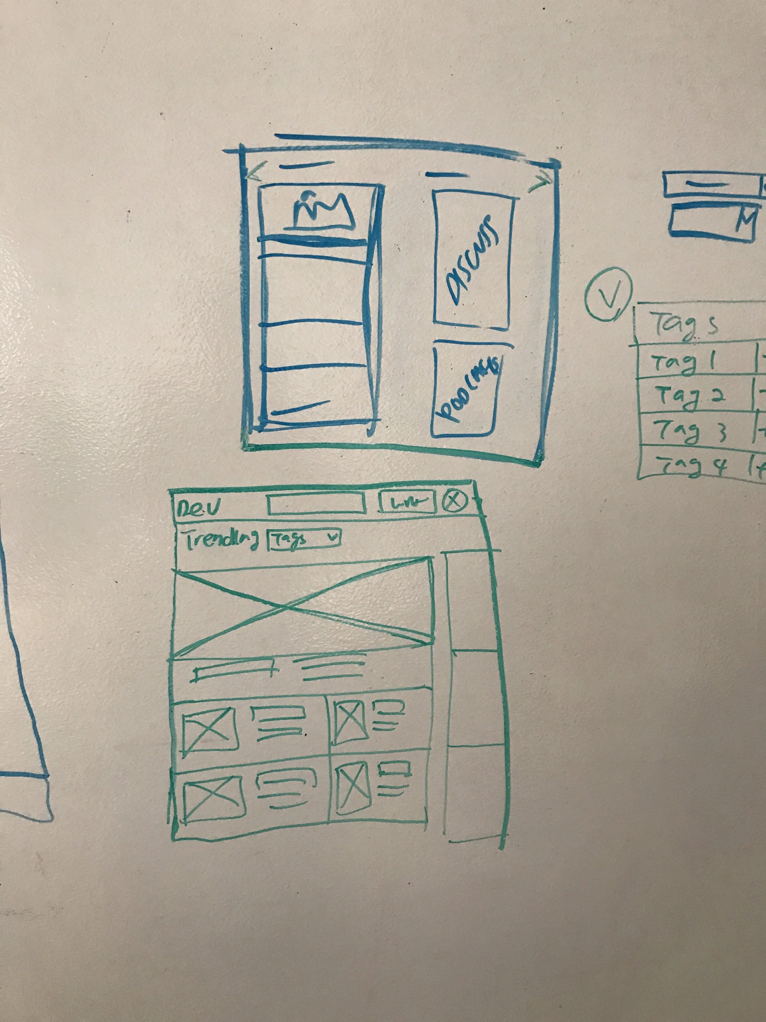
After restructuring our problem statement, we moved into the design phase. dev.to wanted to make some changes while also keeping the site as lightweight as possible. Once we settled on the idea that restructuring the information architecture of the site would be beneficial to users, we focused on changes that could be implemented immediately. The changes were based on insights found through our research process:

Insights leading to design changes
Once we settled on how our insights can be implemented in actual design changes, we moved into our design studio in order to see what these ideas would look like on an interface.

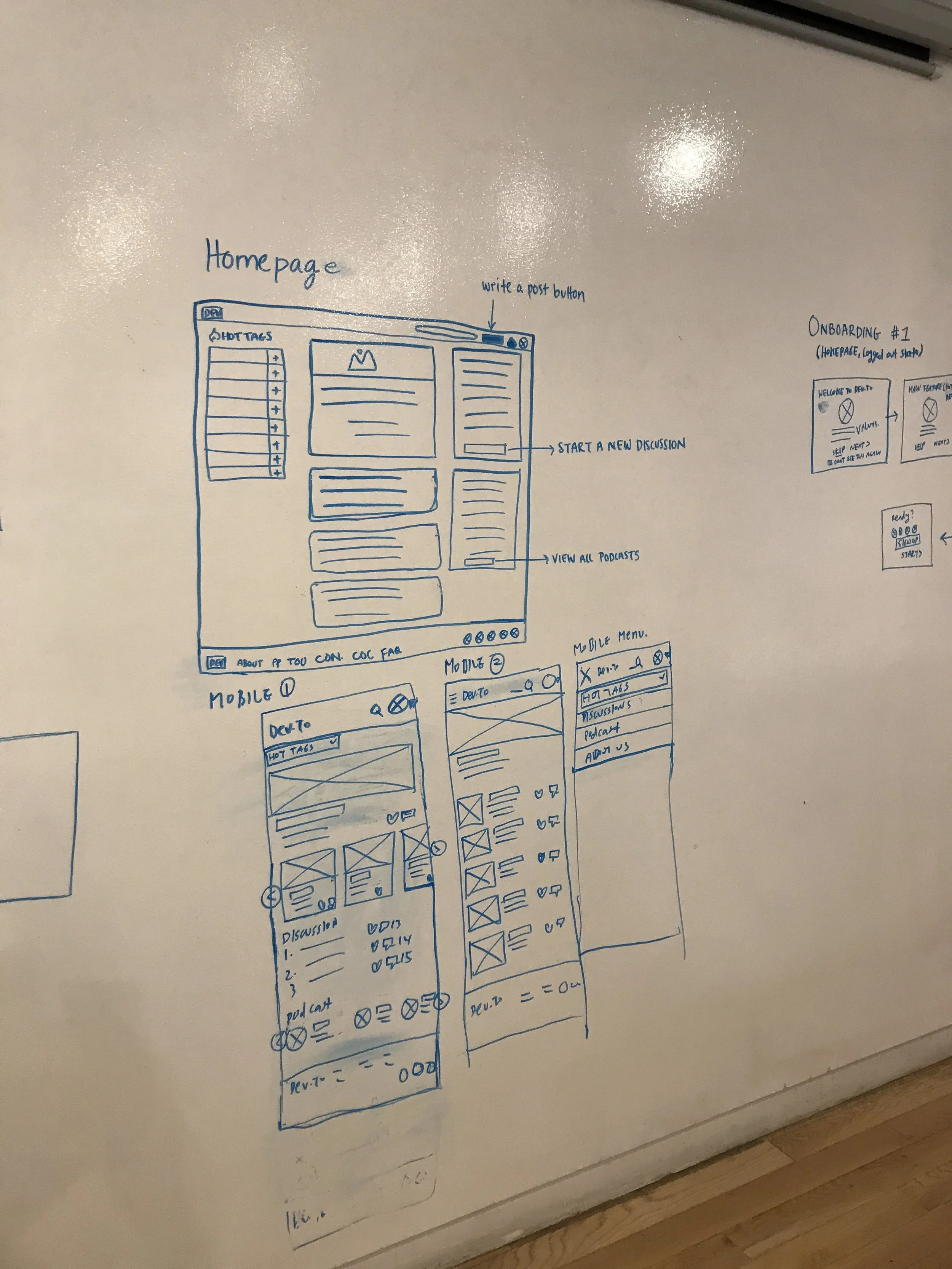

After our design studio, our team digitized our ideas using Sketch and put together our high fidelity prototype using Invision. With this prototype we moved into usability testing of our new iteration.
Usability Testing Round 2
We moved into phase 2 of user testing where we asked users to test our prototype. We tested 5 users with each going through 4 different scenarios ranging from going through the onboarding process to locating content that they wanted to see.
Our testing goals:
Users should understand what dev.to is all about upon sign up
Users should understand what the tags are used for
Users should understand how to access their profile and dashboard
Users should be able to filter and easily access search results
Users should be able to differentiate between comments and replies

A wonderful user going through our newly redesigned onboarding process!
User Testing Results

Revised User Journey
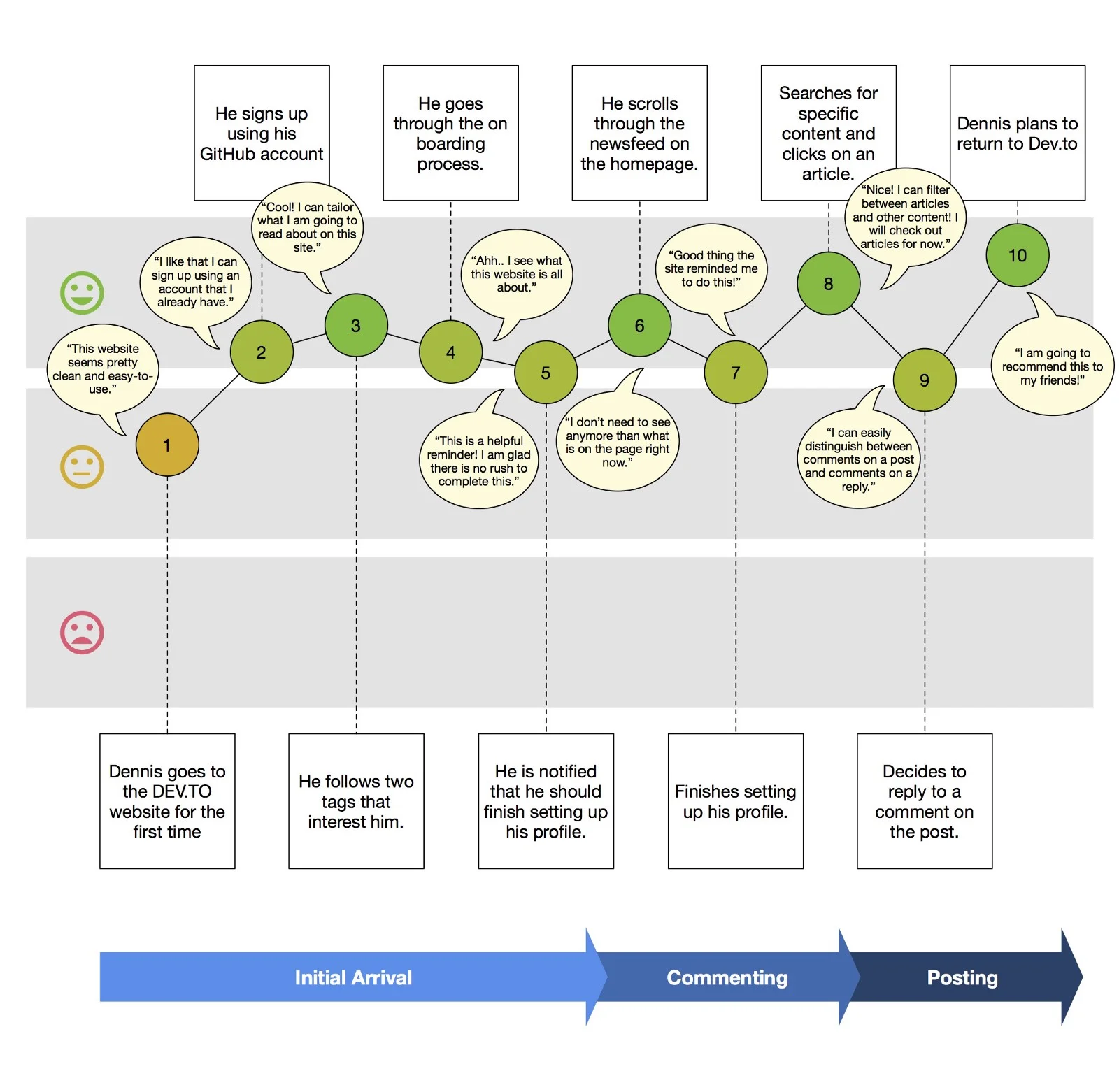
Insight: Dennis is much happier with the process. He is able to complete tasks as needed and had an easier time learning about the site and its functions.
Conclusion
Overall, our research provided us with several insights including the importance of hierarchy and overall information architecture. We saw that restructuring and presentation of content offered benefits that were strong enough to prevent the need to give an immediate overhaul. Users needed clearer definitions of where things were and what they did upon experiencing the interface for the first time. Cleaning up the UI and presenting a quick onboarding process were key and users were happier with the final product. With the changes in place, we saw an immediate uptick in user engagement and account creation. Active users per hour also tripled within 1 week!
Recently, Dev.to raised their Series A and you can read about it here!